London's useless bus route 'spider maps' due for an overhaul
London's transport authorities are waking up to the fact that Beck's overly simplistic tube map is making commuters take wasteful train trips when walking could be faster. It's also time to revisit the city's bus maps, whose design is so poor they often don't even show any destinations!

Kerwin Datu
Harry Beck's iconic map of the London Underground has come into shame in the last two years for misleading pedestrians about the true distances between stations, and making them ignorant of street-level connections. People become dependent on riding the tube an extra station or making an additional interchange, when a short walk would take them to their destination faster.
For example, Bayswater and Queensway are 190 metres apart on the same street, Regent's Park and Great Portland Street 230 metres apart on the same street. But anyone going from Oxford Circus to either Bayswater or Great Portland Street would be persuaded that they had to take two trains to complete their trip.
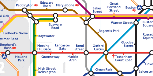
Source: Transport for London
This is unacceptable in a low-carbon age, and with trains packed to the gills in peak hour, Transport for London (TfL) has been installing lovely new pedestrian maps throughout the city to reacquaint locals with the street system and decongest the tube lines. And the city's designers and programmers are locked in a secret battle to build the killer smartphone app that always offers the fastest route.
Forgotten amidst this effort are the city's hapless bus route maps. Rather than show commuters the whole bus network, London's bus maps are content to show you only the bus routes that pass your block and nothing else. Heaven help you if you need to take two buses to make your journey, or if the bus you want is a few streets away; these maps couldn't tell you a thing.
Imagine a tourist couple flying into Gatwick or Luton Airport, and taking a train to Farringdon in the heart of the city. Here it is in the National Rail map — on the only national line that cuts right through the centre.
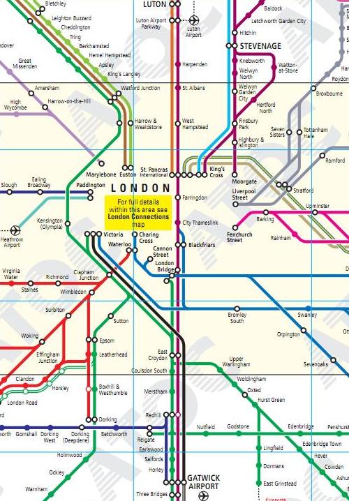
Source: National Rail
They emerge onto the street, hoping to make their way to London's great attractions in one of its famous double decker buses, and this is the wall map that greets them. Quite the bustling city, isn't it?
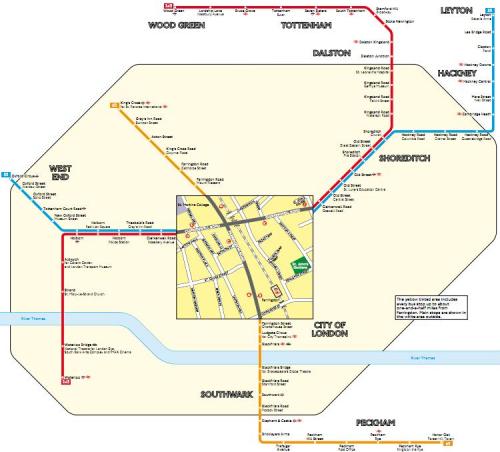
Source: Transport for London
They'd be forgiven for thinking that only three bus routes crossed the city centre, none of them going anywhere very important. Holborn Police Station, anyone? In fact there are 13 bus routes passing alongside the blocks immediately surrounding Farringdon station according to the online bus maps launched this year, but because of where the street grid has been cropped all but three are hidden from readers of the wall map.
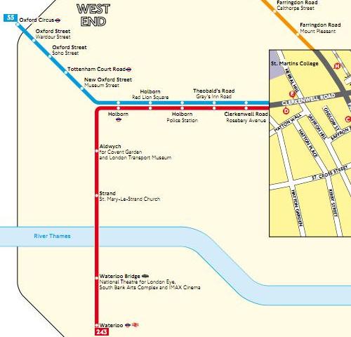
Below is the close-up of the West End, London's famous theatre district, and home to the British Museum and the National Gallery. But how would our dear couple find them? How might they find such landmarks as Buckingham Palace, the Houses of Parliament, or Trafalgar Square? They'd most likely duck back into the Underground system, congesting the trains again, and missing out on the wonderful view from the top floor of a London bus.
These maps, which TfL call 'spider maps', fail at the very first task: helping you identify your destination. Normally, once you've found where you're going on a map, you work backwards to where you are. But not here. On these spider maps, you are only shown where the closest bus routes want to take you, not where you want to go. It's like the old joke they tell beyond the Pale: when asking a local for directions one is told, 'well, if that's where you want to go, I wouldn't start from here!'
Of course, I've chosen an extreme example, but it's a telling one. Open any of these maps (will pop up in a new window), and see if you can find your way to any of the other destinations. For example, open the map called Tate Modern, which shows the Tate to the right by the river, and ask yourself how you would take a bus to the Houses of Parliament or Buckingham Palace using this map.
Houses of Parliament, the Tower of London, Buckingham Palace, Trafalgar Square, the British Museum, the Tate Modern, the Victoria & Albert/Natural History museums, St Paul's Cathedral.
For comparison, below is a close-up of what the bus shelters of Paris offer within the same space of an A1 poster.
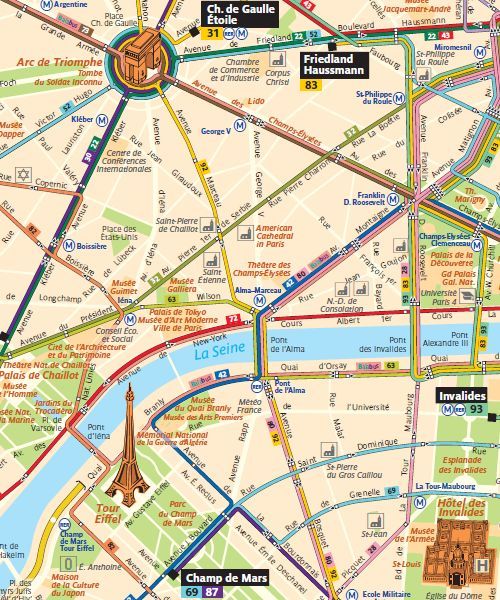
Source: RATP
Consider what this shows that the London maps don't: Your destination. Drawn in three dimensions if it's a major landmark. Every bus route in the city. It even shows every bus stop (the little white squares) if you care to count them. Every street that runs for more than one block is shown, and labelled. Every metro, regional and national rail connection. Every park and every church. All in beautiful colour. If it's too much detail to take in all at once, each bus stop also has a local street map to help you find your bus stop, as well as a route map for each individual bus route.
So if you wanted to go from the Eiffel Tower to the Arc de Triomphe, you'd know that you could walk down any street to find the route 92, or cross the river and the Trocadero gardens to find the 30 or 22, even if none of them pass by the Tower directly. You might have to cope with the French names of the major sights but as they say, when in Rome … !
Update 13/07/11: Jarrett Walker, a notable public transport planning consultant, has provided a judicious response to this article here and here on his excellent blog, Human Transit. (So too have his readers!)
